UX strategy and creative direction for Bancolombia
Objectives
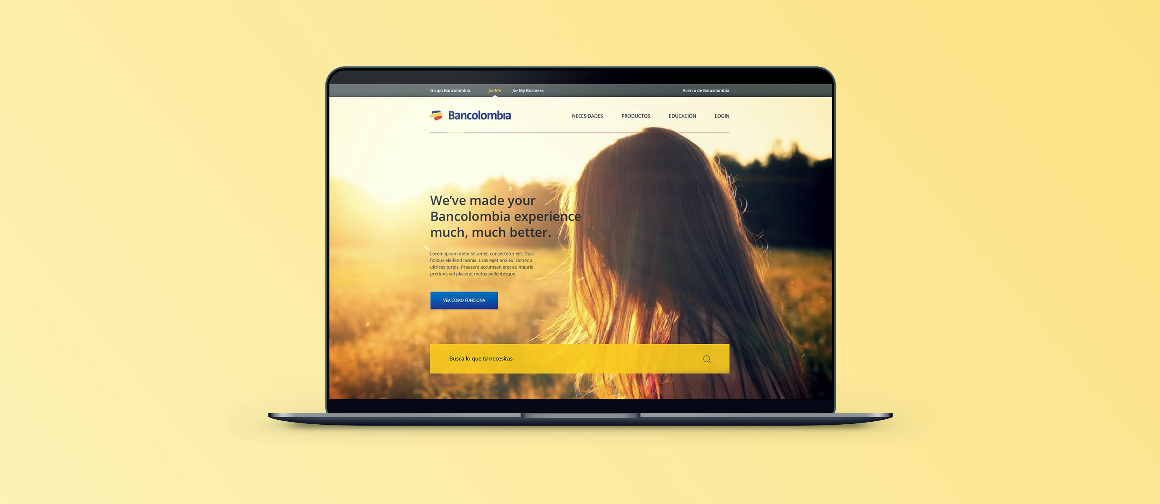
We wanted to combine dozens of brands and fragmented experiences into a single product with a consistent information hierarchy, content management system, and governance system. To achieve this, we would completely redesign the bank’s website:
- Users should be able to navigate the bank and its subsidiaries based on their needs, not based on the bank’s internal structure.
- All of the bank’s properties, across multiple countries and brands, should be integrated into one system that’s consistently searchable, navigable, and maintainable.
- Users should prefer using the website to visiting branches or calling call centers for most interactions with the bank.
- A fragmented product and service catalogue should be consolidated into fewer, needs-based products that are easy to distinguish and understand.
Design principles
Enable relationships. Building a social bank starts with the understanding that users aren’t individual islands. They communicate, interact, share, and transact with others. We wanted to design to enable those relationships.
Know and surprise. We wanted content to be dynamic and adapt to everything we know about an individual user. From dynamic campaigns, to birthday easter eggs on the website, we want to deliver an experience that is relevant to each individual in a refreshing way.
Be human. Talk to users without jargon, talk about their needs, not products. Hide complexity in favor of simplicity.
Educate. Financial stress is a huge factor in many users’ lives, and much of that comes from uncertainty, or a lack of understanding. We want to educate users on financial matters when they’re relevant, so that users can make informed decisions.
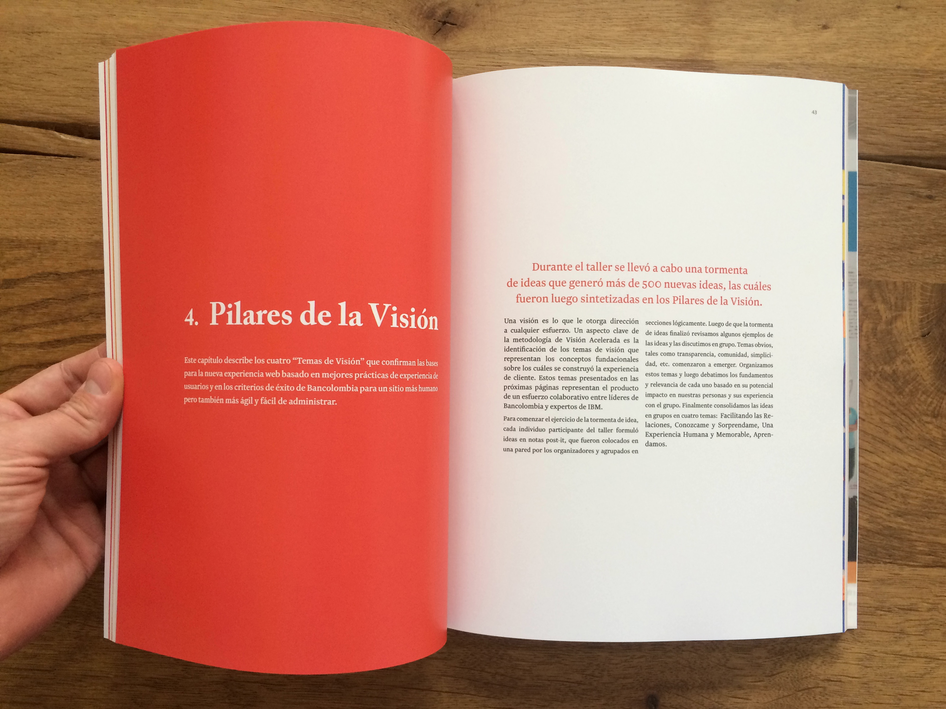
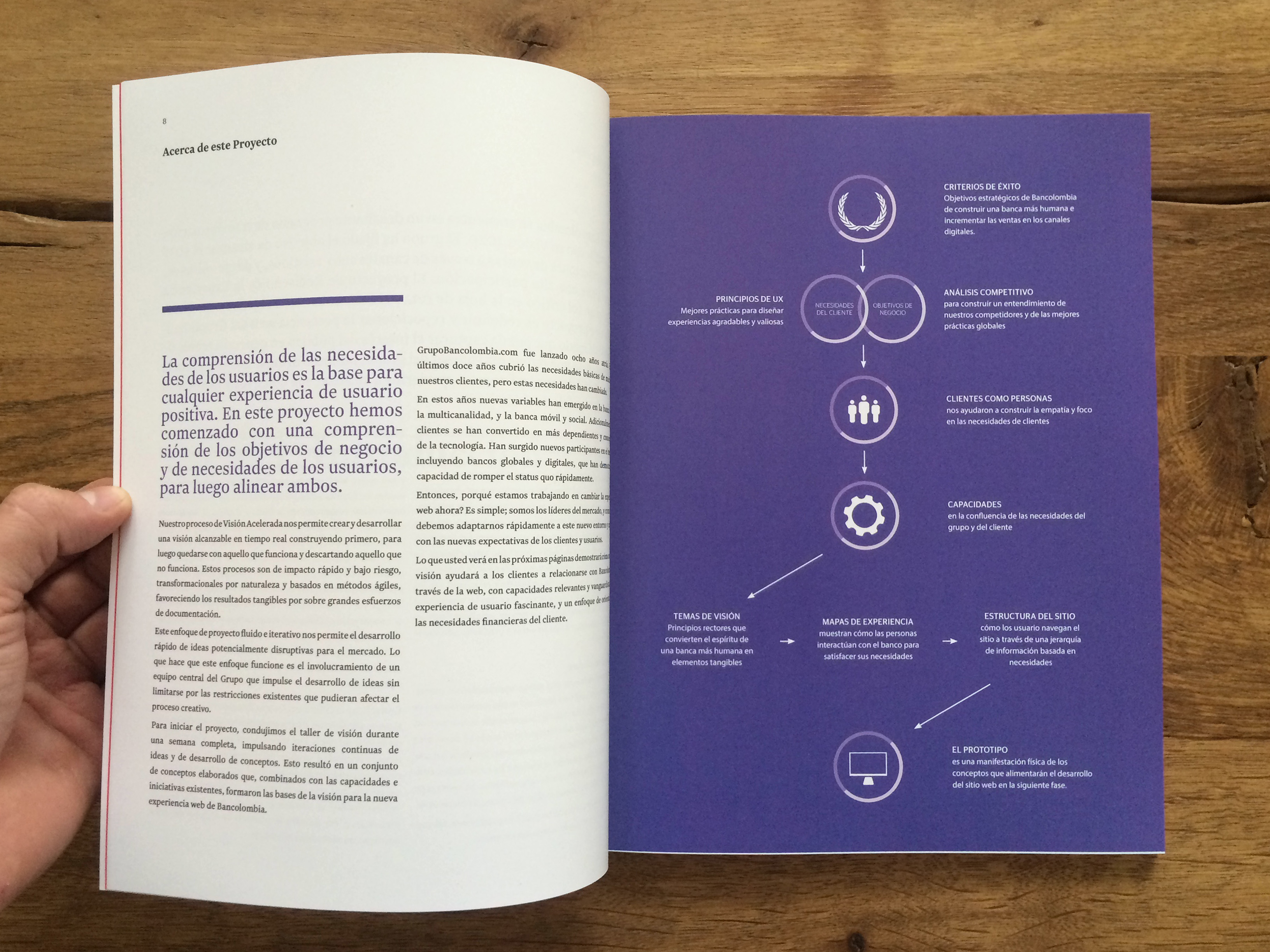
These principles came out of five-day workshop I ran for the bank’s stakeholders.
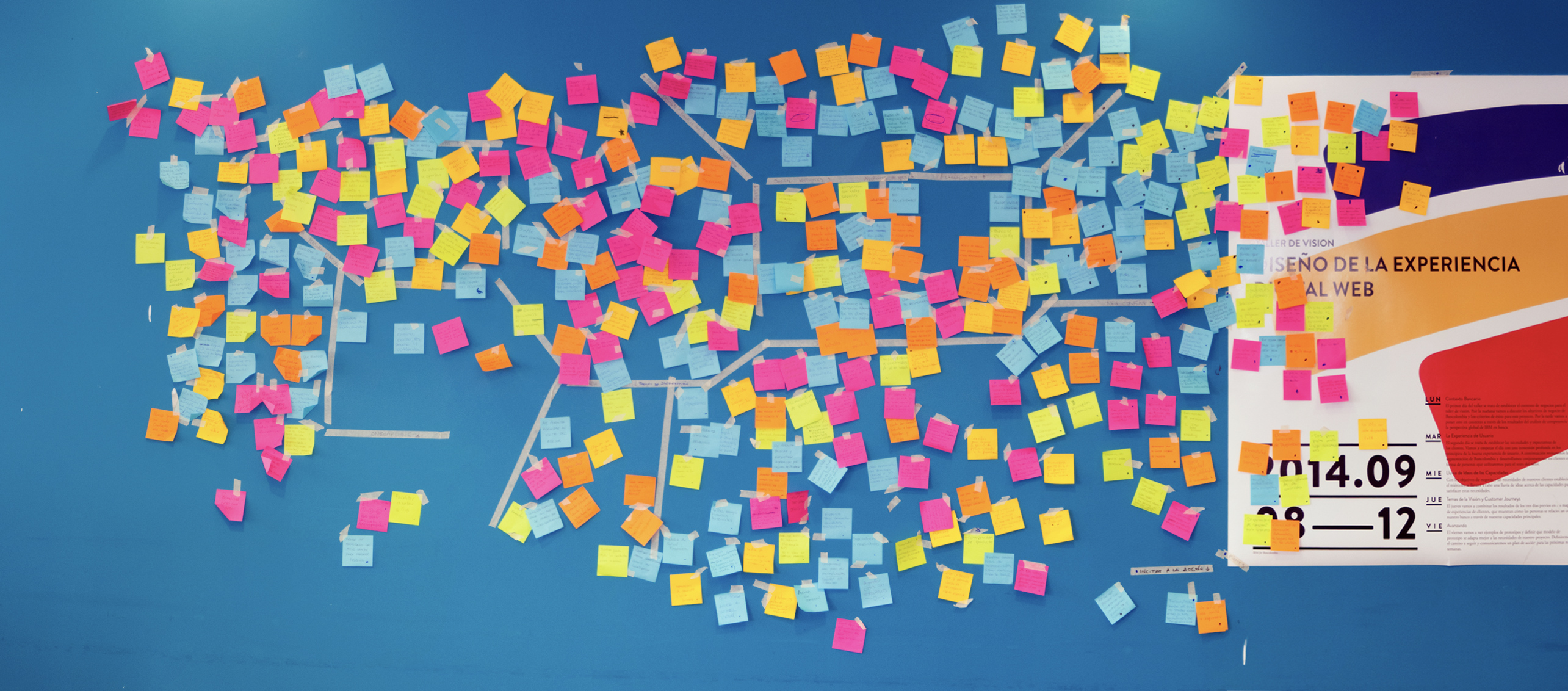
I made a book which became required reading for everyone who joined the project:
Execution
I oversaw the user experience strategy and provided creative direction. I worked with IBM who provided the technology, Chef who wrote thousands of pages of copy and produced detailed designs under my direction, DDB who provided assets for marketing campaigns and marketing assets, and of course the bank.
In the end, we went from the first brainstorming session to launch in fifteen months.
We spent three months in a strategy and vision phase. We built some prototypes, but we mostly built tools to communicate the project goals and the vision internally. Not only was it important that everyone understood why we were doing what we were doing, but our stuff looked sharp. Everyone good wanted to be on this project, and that makes all the difference.
We itemized ~1000 products and services the bank provides, down to each credit card and insurance policy. I then organized these products into a meaningul hierarchy and cross-indexed each product with particular user needs that the product fulfills to ensure each product is easily discoverable in the context of an actual customer need. In some cases we simply decided to consolidate the product portfolio and remove or not expose products.
Detailed pages for each product and service were written from scratch. Descriptions were written after lengthy SEO investigations, fee structures and rates were collected and exposed. In the end, thousands of man-days of copywriting produced a beautiful, clear, and descriptive site.
Users all the way down
One of my favorite parts of the project was that we involved users in the design process from the very beginning. We constantly shared early prototypes or mockups in informal ways with people close to the bank, but with no particular knowledge of the bank: the team in the dining hall, the security team, friends and family.
We made a video to help the hundreds of people involved in the project empathize with our users and understand why it’s important to present information and products in a familiar, jargon-free language. Inspired by Google Chrome’s What is a Browser? video, we interviewed people on the street in Medellín asking them to explain banking terms like checking and savings accounts, or which customer segment they were in (how users navigated the site before the redesign). One man suggested that checking accounts are for real money, while savings accounts are for money that doesn’t really exist.
Takeaways
We were already building one of the most visible websites in Colombia and we still spent a ton of resources communicating internally what it was we were doing. We wanted everyone on the project to understand the design principles and the objectives that underpinned the project.
When things got rough, we were able to talk about them. As a team. Across companies. I think what made this project feel different is that every individual contributor, from executives to developers saw this project as individually important to them. A tight-knit client team goes a long way to success. This was the most motivated, ready to collaborate, and genuine group I’ve worked with. This is easily my favorite client project ever.
This was my first project that was entirely in Spanish. After six months, of working, playing and dreaming in Spanish, I was fluent enough.